Built a strategic decision layer for GSS
The Gold Savings Scheme data existed everywhere and lived nowhere. I added a focused analytics layer to the employee dashboard that unified it, so the business could make better decisions rather than just see more numbers.
- Role
- Sole product designer
- Scope
- Analytics + system extension
- Stakeholders
- Leadership & core teams
- Platform
- Internal web dashboard
- Problem
- GSS data was fragmented across four sources (GA, backend, marketing, CX) with no shared view. Roadmaps ran on assumptions, drop-offs surfaced late and revenue-leakage signals were missed.
- My move
- Mapped the decisions stakeholders actually needed to make, turned 7 recurring business questions into 7 KPIs, and shipped a focused analytics layer instead of a data dump. Built the design system's missing data-visualisation vocabulary along the way.
- Outcome
- 4 fragmented sources became one view. Internal conversations shifted from opinion-driven debate to data-driven prioritisation, and 3 other internal tools now reuse the chart components.
- Learning
- I shipped a measurement tool without measuring it: instrument the dashboard itself from day one, so adoption is a number, not an anecdote.
This was not a lack of data. It was a lack of alignment.
The reframe that set the whole direction
Two growth engines, one blind spot
Two growth engines, and the recurring one was flying blind.
Reliance Jewels runs on two growth engines: the e-commerce platform drives high-ticket purchases, and the Gold Savings Scheme (GSS) lowers the entry barrier and drives recurring revenue and retention.
The business team was working around distracting priorities in GSS while the real gaps stayed hidden in the clutter. My goal was a focused analytics layer for GSS: not more data on screen, better decisions off it.
The data existed. The shared view did not.
The data existed everywhere and lived nowhere, so decisions ran on assumptions.
All GSS data already lived in Google Analytics and backend systems, but it was fragmented. Product saw partial numbers, marketing tracked campaigns and CX handled payment defaults separately. There was no shared view of performance.
So roadmap discussions relied on assumptions, drop-offs were discovered late and revenue-leakage signals were missed.
Start from the decisions, not the data
I started from the questions leadership kept asking, not the metrics that happened to be available.
Before designing anything, I mapped the decisions stakeholders needed to make. The business questions that were constantly asked but rarely answered clearly became the North Star.
“How much did we grow month over month?”
“Where are customers dropping off?”
“Are instalments being paid on time?”
“Which categories are GSS redemptions flowing into?”
“Which scheme durations are most adopted?”
“What is the ratio of new versus existing customers?”
“Why are payments failing?”
The goal was clarity, not completeness.
Adoption over complexity
We shipped the seven KPIs that change decisions and deferred everything that risked the dashboard being ignored.
There were options for more advanced analytics: predictive models, cohort deep-dives and forecasting. We chose not to ship them in the first release. A dashboard that overwhelms leadership gets ignored, and an ignored dashboard changes no decisions.
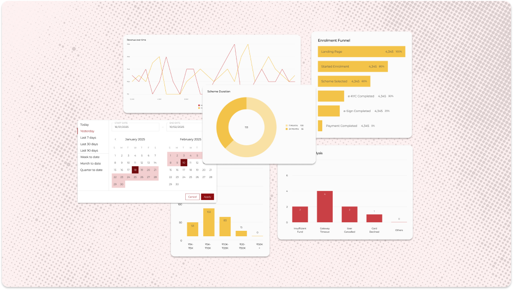
- Revenue & MoM growth
- Funnel drop-off by stage
- Payment status buckets
- Redemption & duration mix
- Predictive models
- Cohort deep-dives
- Revenue forecasting
Overdue instalments were grouped into buckets so CX could prioritise recovery by risk instead of scanning a flat list.
Funnel drop-offs were structured by stage, with each stage tied to the intervention that could recover it, so a number on screen always pointed to a next move.
The design system had no way to show data. So I built one.
- No graph patterns
- No date selectors
- No density controls
- Reusable, atomic chart components
- Consistent with the existing tokens
- Documented for the next team
Four sources became one view. The components outlived the project.
The attributable proof: three other internal tools adopted the chart components, with no mandate to.
- Fragmented data sources
- Reactive decision making
- Ambiguous roadmap planning
- Unified performance view
- Proactive risk monitoring
- Data-driven prioritisation
One claim I deliberately keep soft: from inside the team I watched roadmap debates start from the funnel view instead of opinion. I observed that shift, I did not measure it, so it stays colour here rather than a headline.
What I'd do differently
I shipped a measurement tool without measuring it. Instrument the dashboard itself from day one.
The KPI mapping held up in use; the grouping debates that surfaced in the first sprint were small. The real gap is that this dashboard has no instrumentation of its own: which KPIs get opened, by whom, before which decisions.
Usage analytics on the analytics would have turned this case's behavioural claim into a number. That is the first thing I'd wire in next time.