Rebuilt a design system that had no reasons in it
Reliance Jewels is a jewellery chain, part of India's largest retailer. They had a design system already and nobody was building from it, so the first job was finding out why. It was one Figma page of swatches, with no rules and no reasons on it. I rebuilt it to hold the reasons, and that turned out to be what the engineers had been waiting for too.
- What it is
- The design system behind a jewellery storefront
- What I owned
- The whole rebuild, from the audit to the docs site
- Who it was for
- Our designers first, then the engineers building from it
- What changed
- A brief now becomes a finished screen the same day
- Problem
- Nobody was building from the system we had, so I went to find out why. It had no reasons in it. One Figma page of swatches and two typefaces, with no rule for when to use which. A new designer could not build from it and neither could a model. The engineers had stopped following it too.
- My move
- I rewrote the system so every value carries its reason: what it is, when to use it and what never to do with it. Then I asked the frontend team what format they actually needed, and built it in that. 1552 named values and 45 components, each shipped with its spec, its code, its docs and its Figma in step.
- Outcome
- A brief now becomes a designed, on-system screen the same day instead of the same fortnight. Engineering builds from the same file, because following the system is now faster than working around it.
- Learning
- I started this as a design-team problem and it was never only that. The day I asked the engineers what the old system cost them, the whole architecture changed.
A design system with no reasons in it cannot be followed. Not by a new designer, and not by a machine.
The line the whole rebuild came out of
The system said what to use and never why
A model needs the reason behind a value, the same as a new designer does. Ours had none.
A jewellery store carries unusual weight online. Nobody impulse-buys a ₹2 lakh necklace. They research, they visit a showroom, they come back a week later. The site has to extend the showroom and never once feel cheaper than it.
Our team had started using AI to draft screens. It was fast and it was useless. Everything it gave back looked like a generic dashboard, because we had nothing to point it at that described how a Reliance Jewels screen is supposed to behave.
That is when the design system stopped being a tidy-up job and became the actual problem. A model needs the same thing a new designer needs on their first week: the reason behind the swatch.
One Figma page, and not a single reason on it
Not one value on it had a reason. The page where people spend money scored 1/5, and both teams had stopped opening the system.
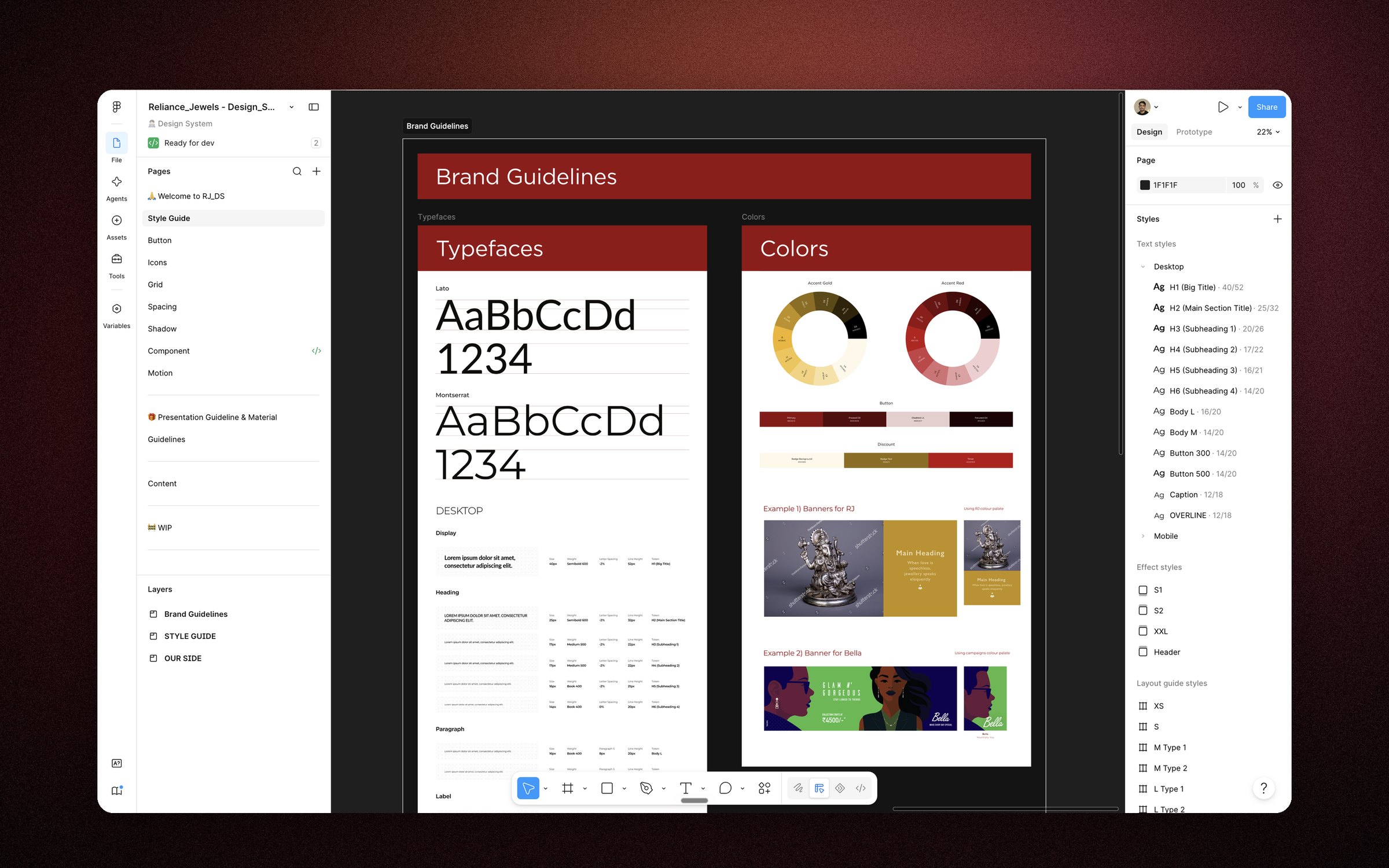
The design system I inherited was a single Figma frame titled Brand Guidelines. It looks tidy. Look closer and there is nothing to build from:
 123
123- 1Two typefaces shown as specimens. No scale, no sizes, no rule for when either is used.
- 2Colour as decoration: two wheels with no token names, no roles, no contrast pairs.
- 3This one page is the entire system. Zero interaction states documented anywhere.
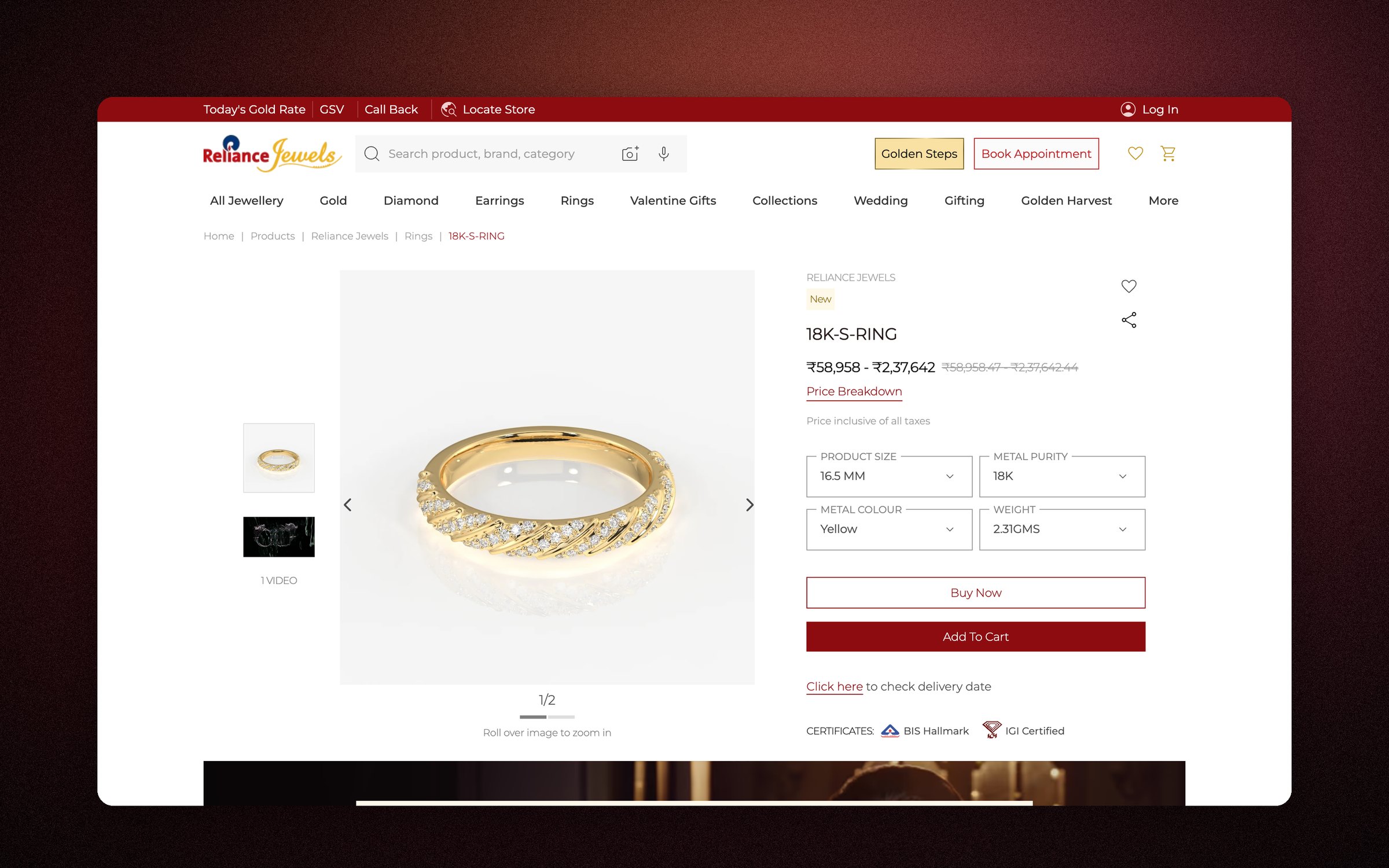
A poster can't hold a product together. I walked all nine live surfaces and scored each on two passes, functional and emotional. On a trust product, the emotional score is the one that matters, and the product page, the screen where a wedding budget becomes a decision, scored 1/5:
 123
123- 1SKU code (“18K-S-RING”) shown where the product name belongs.
- 2A price-breakup table where every value is a dash.
- 3Buy Now and Add to Cart hierarchy inverted. No occasion, no story.
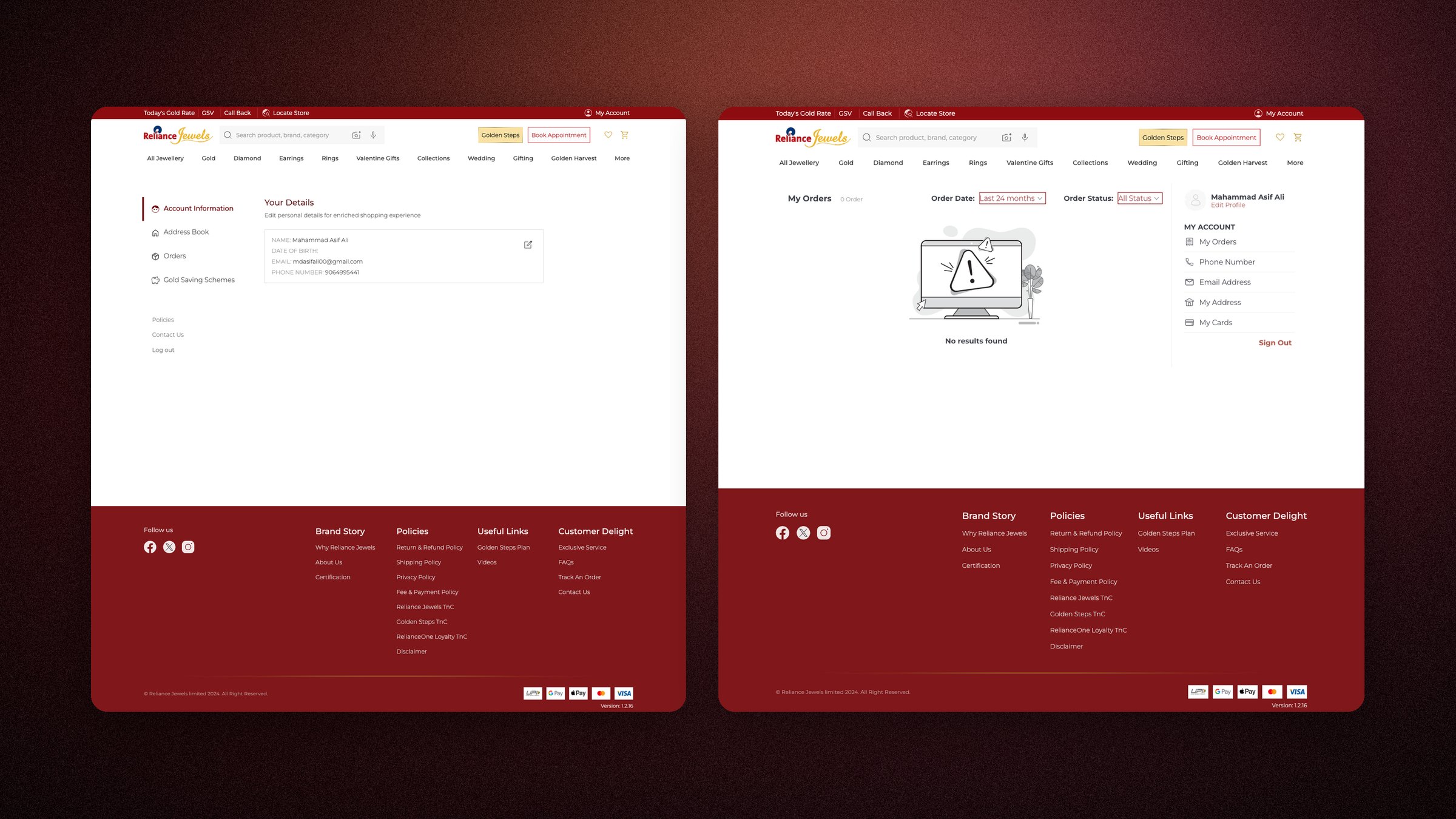
On a jewellery store, inconsistency reads as carelessness. Someone spending lakhs notices.
Then the part I was slow to see. The system had not been left unfinished. It had beenabandoned, by both the teams it was meant to serve.
The engineers had stopped following it at code level. We were deviating from it in Figma. Two teams walking away from the same document, and nobody saying so out loud, because from either side it just looked like the other one had moved.
It stayed that way because the design team could not see the technical reasons it was failing, and I could not see them from inside Figma. So for a long time there was nothing anyone could put on a roadmap. Nobody was repairing the system. They were routing around it.
Then I asked the engineers what they needed it in
The format that made the system readable by a model was the same one their build already used. I was solving two problems and only knew about one.
I had to pick a format to write all this down in, and I did not want to pick it from taste. So I asked the people who would have to build from it.
What came back was a cost. The storefront runs on Vue 2 and a commerce platform called Fynd, which builds its styles from Less files. A design system in any other format is something an engineer translates by hand, every time, on every component. They had never rejected the old system. They had worked out that following it was slower than ignoring it.
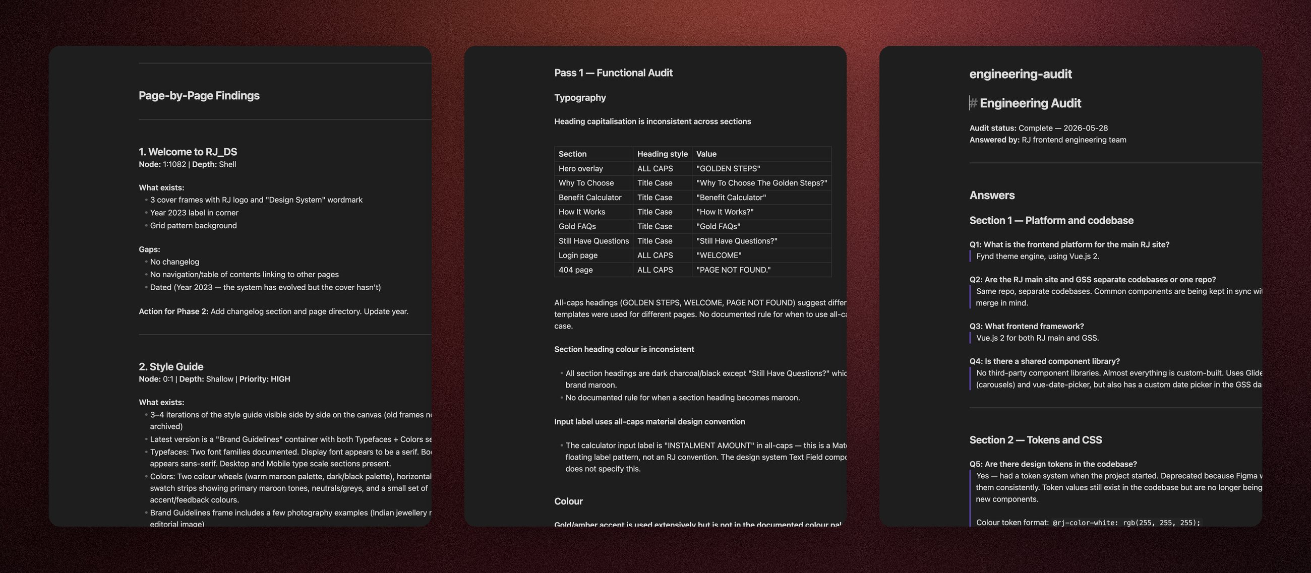
I wrote the questions. The engineers wrote the answers. I could not diagnose their side of this, but I could work out what I needed to know, so I put together a questionnaire aimed at the gaps and asked the RJ frontend team to fill it in. Their answers are the most useful document in the project, and none of the content is mine.
Here is the part I did not expect. The thing that makes a system readable by a model and the thing that makes it cheap for an engineer are the same thing: every value named, in one place, with the reason attached. I had started this so our designers could work faster. It turned out to be the fix for a problem the engineers had stopped complaining about.
Once that was the brief, most of the architecture stopped being a matter of taste.
The old components were built to “good enough”: hard-coded hex, raw pixels, zero variable bindings. The first job was an architecture, not a reskin.
Nine live surfaces walked and scored twice, functional then emotional. The failures became the component priority order, transaction-critical first.
A questionnaire I wrote for the gaps, filled in by the RJ frontend team. It decided the token format on the spot: Less variables, because that is what their build already consumes.
Every value has to earn its place. If you cannot say why, it does not ship.
That one rule is what later made the system machine-readable.
The calls that gave the system its character
Type, colour, depth and motion were each decided again, against what the brand is meant to feel like.
Make the .less file the single source of truth
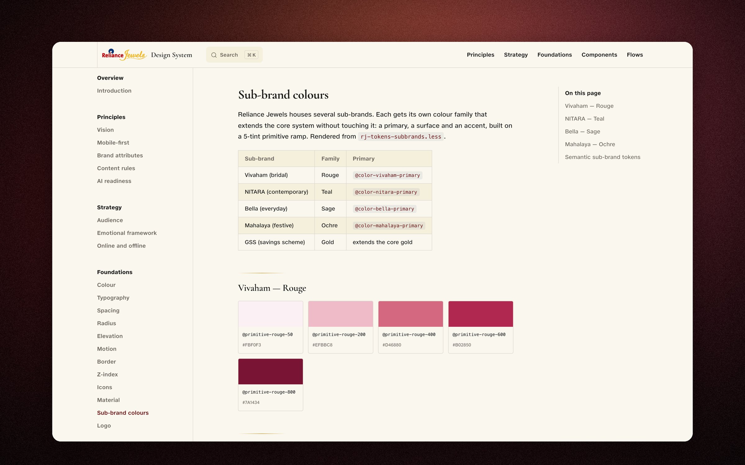
The last system died the day its docs drifted from its code. After that nobody had a reason to open it, so I removed the possibility. A build script parses every token file, resolves the alias chain and emits the JSON and CSS that drive the live docs site. Figma variable names mirror the .less names. The spec, the docs, the code and the design tool cannot silently disagree, because there is only one of them now and the rest are generated from it.
Two type voices where there was one
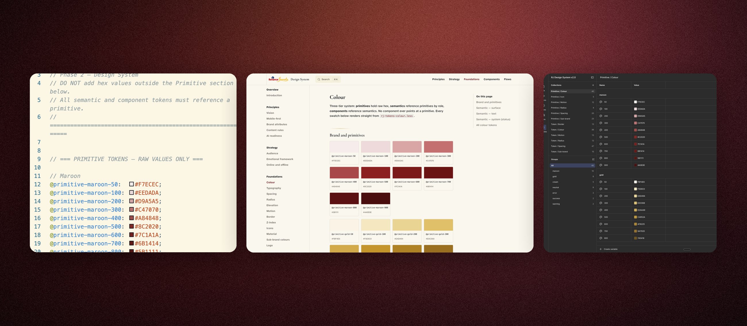
The old system set everything in sans. Jewellery needs ceremony, so the rebuild pairs Cormorant Garamond for display moments with JioType Var for UI and body. The pairing has guardrails born from real misuse: numerals never render in the serif, because its figures read badly at UI sizes, and the display face stays scarce so it still feels special when it appears.
A colour language per persona, without touching the core
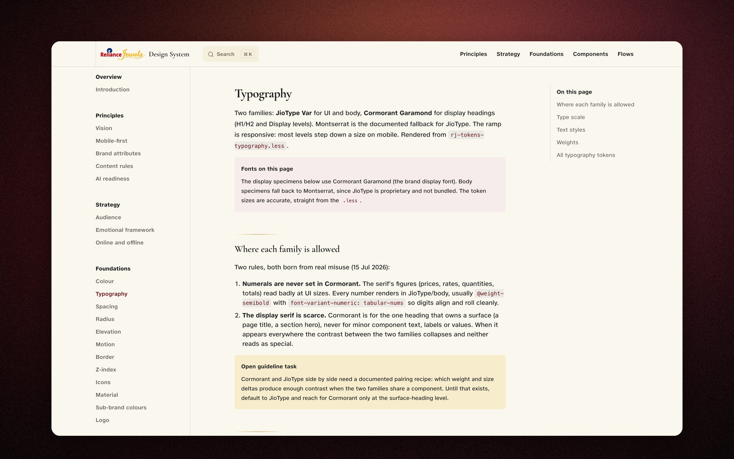
Maroon and gold could not stretch to every audience the brand serves. So each sub-brand gets its own family that extends the core system instead of modifying it: Vivaham's bridal rouge, NITARA's contemporary teal, Bella's everyday sage, Mahalaya's festive ochre. Each is a five-tint primitive ramp with its own primary, surface and accent semantics, rendered from the same token pipeline as everything else.
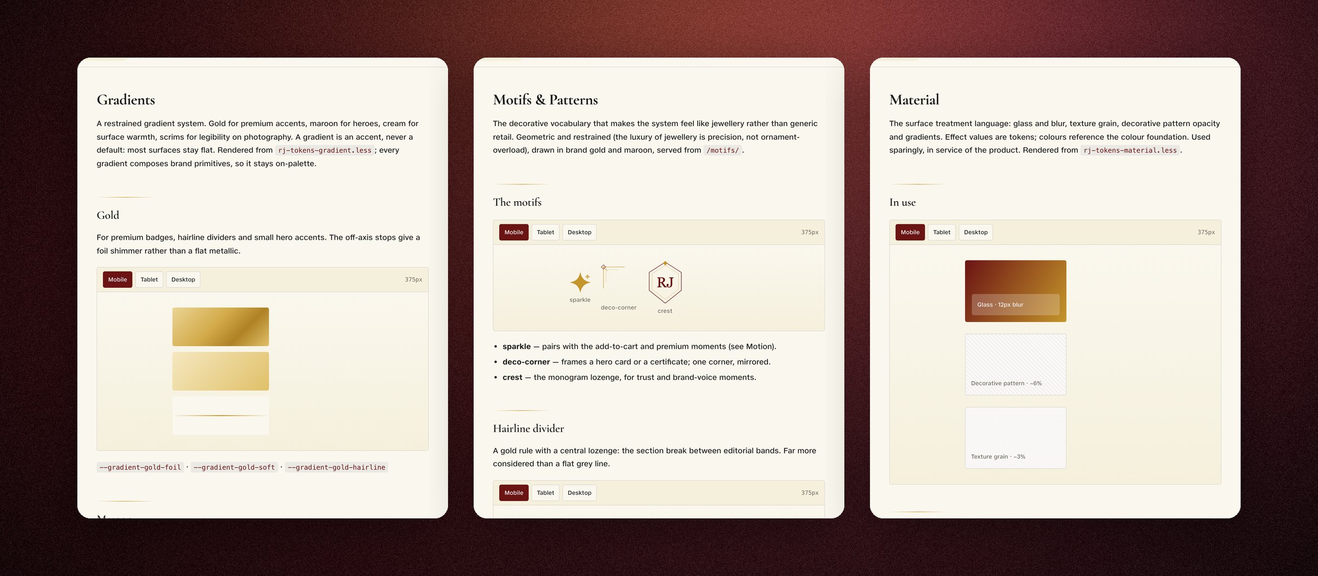
Depth where the product was flat: gradient, motif, material, motion
The live product was flat in every sense. The rebuild adds a depth layer with jewellery restraint: a gradient system where gold shimmers like foil and most surfaces stay flat, a motif vocabulary (the sparkle, the deco corner, the RJ crest) that is geometric because the luxury of jewellery is precision, glass and grain as tokenised surface treatments, and motion that is delicate and quick. Nothing bounces.
Motion rules live in the same token files as colour: durations and easings are named values, so “smooth and delicate” is a spec a component either honours or fails.
One language for “selected”, one voice for icons
“This is selected” now has exactly one vocabulary across all 45 components: the maroon fill with a drawn check, the maroon left-border, the maroon underline. Icons are Phosphor instances from the system, Light by default, Fill only to mean active or saved. And because JioType Var has no semibold, the system bans faking one. The drift I started the audit with is now structurally impossible.
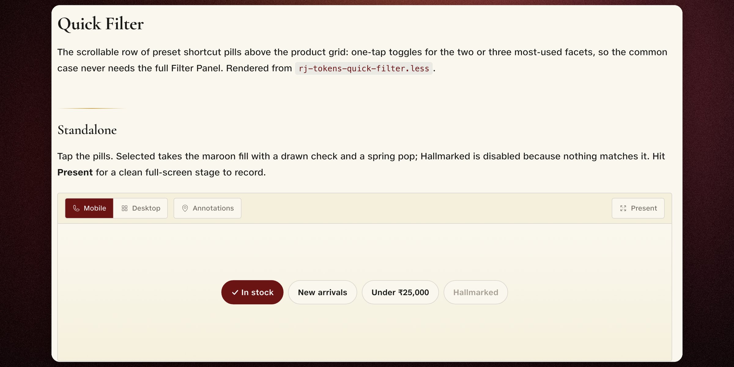
Nothing is finished until a script says it is
Don't take the spec's word for it. These three components are rebuilt right here from the system's own token values: the maroon, the cream, the radius, the 48px targets, the all-caps labels. Hover, press, toggle the state.
JioType is proprietary, so these demos substitute a stand-in sans
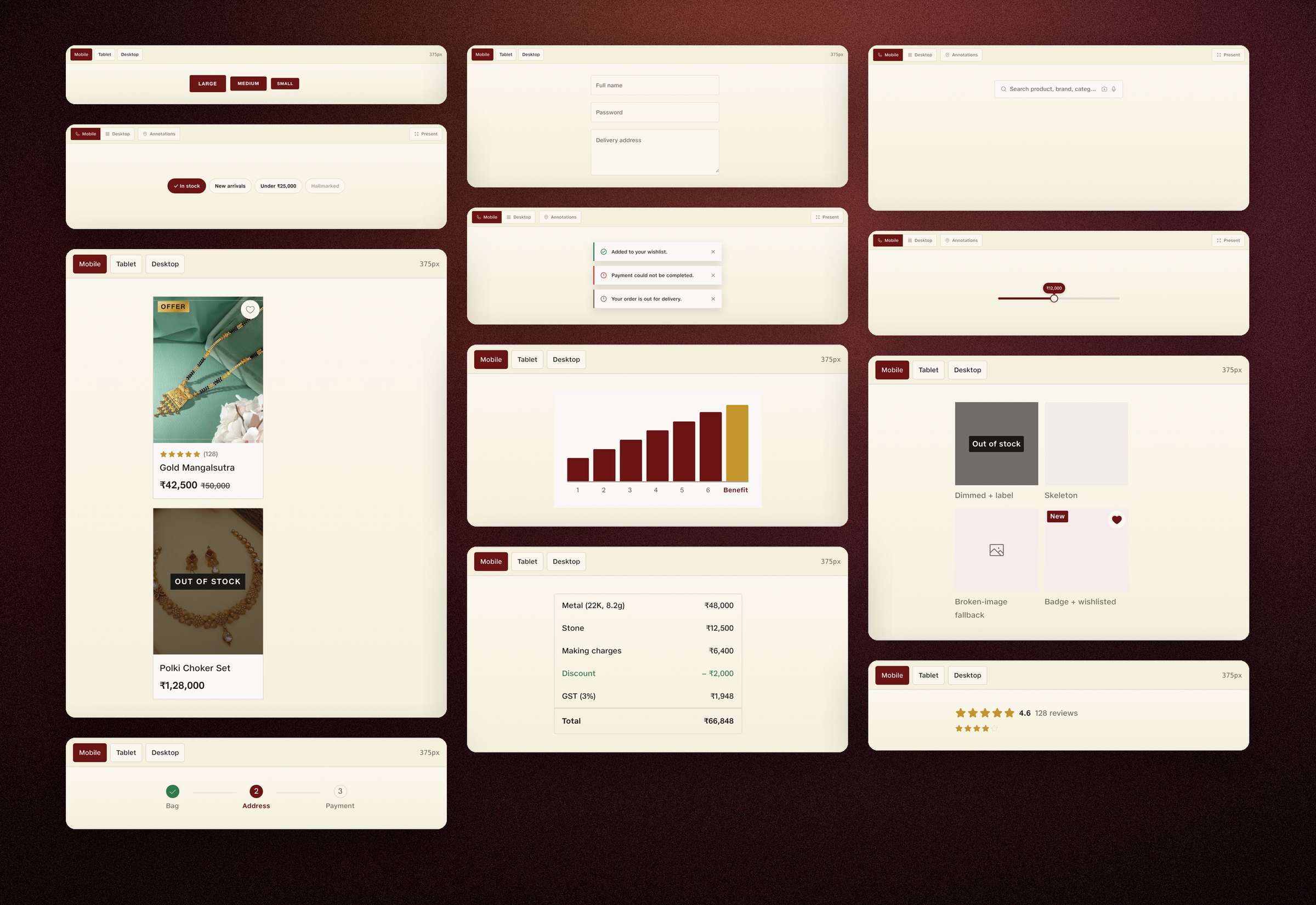
Then I caught myself making the same thing again
I had written excellent documentation, which is exactly what the last system was.
Mid-project I wrote a critique of my own work. One line of it stopped the build:
The documentation is excellent. The design system does not exist yet.
From the critique I wrote against my own work, mid-project.
Which is, word for word, the thing I had spent three audits diagnosing. A beautiful document nobody builds from. I was on my way to handing the frontend team a better-looking version of the artefact they had already abandoned once.
So I stopped making parts and built whole journeys out of them. The homepage, discovery, the product page and the cart, rebuilt entirely from documented components, on desktop and the mobile web. If the system could not compose its own storefront, it was not done.
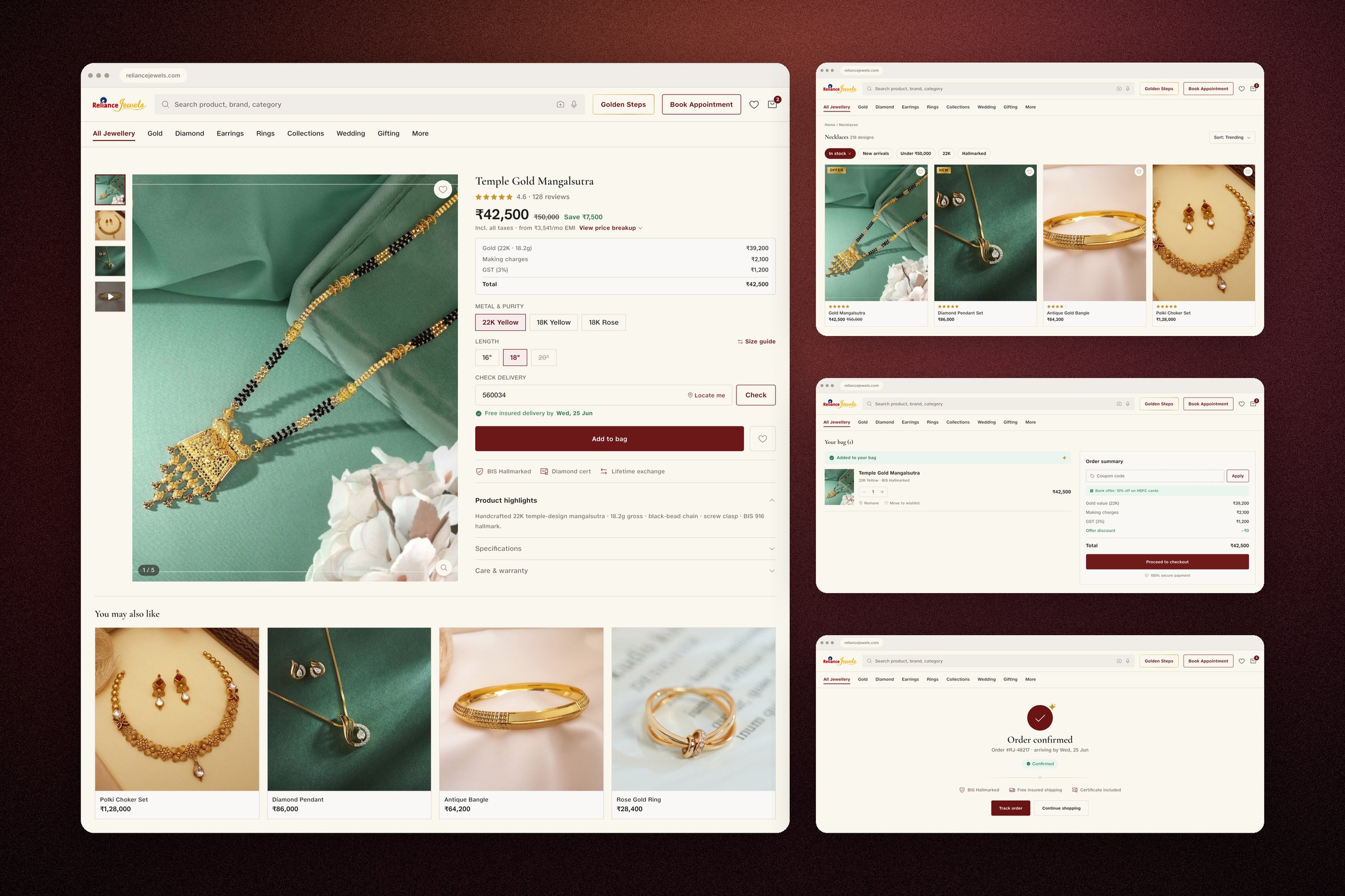
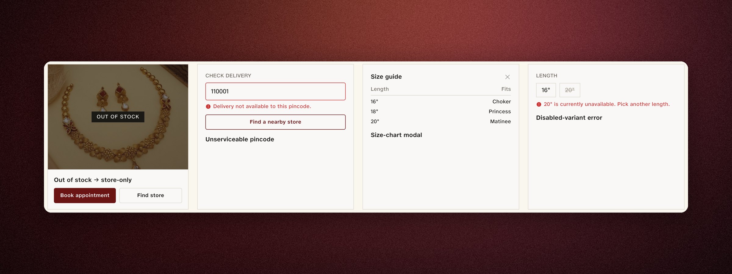
Mobile is the primary surface here. The system's base CSS is mobile, the touch floor is 48px, and the flows were rebuilt phone-first before the desktop frames existed.
I published my own failing score
I scored my own flows on the same bars and published the 2.4, with the fix plan attached.
Before any flow counts as done it runs two written checks. The UX bar goes first: feature parity, every state designed, accessibility. Then the luxury bar, eight tests of restraint and finish that end with one question: would this sit beside Cartier without apology? Both live in the governance folder as written specs.
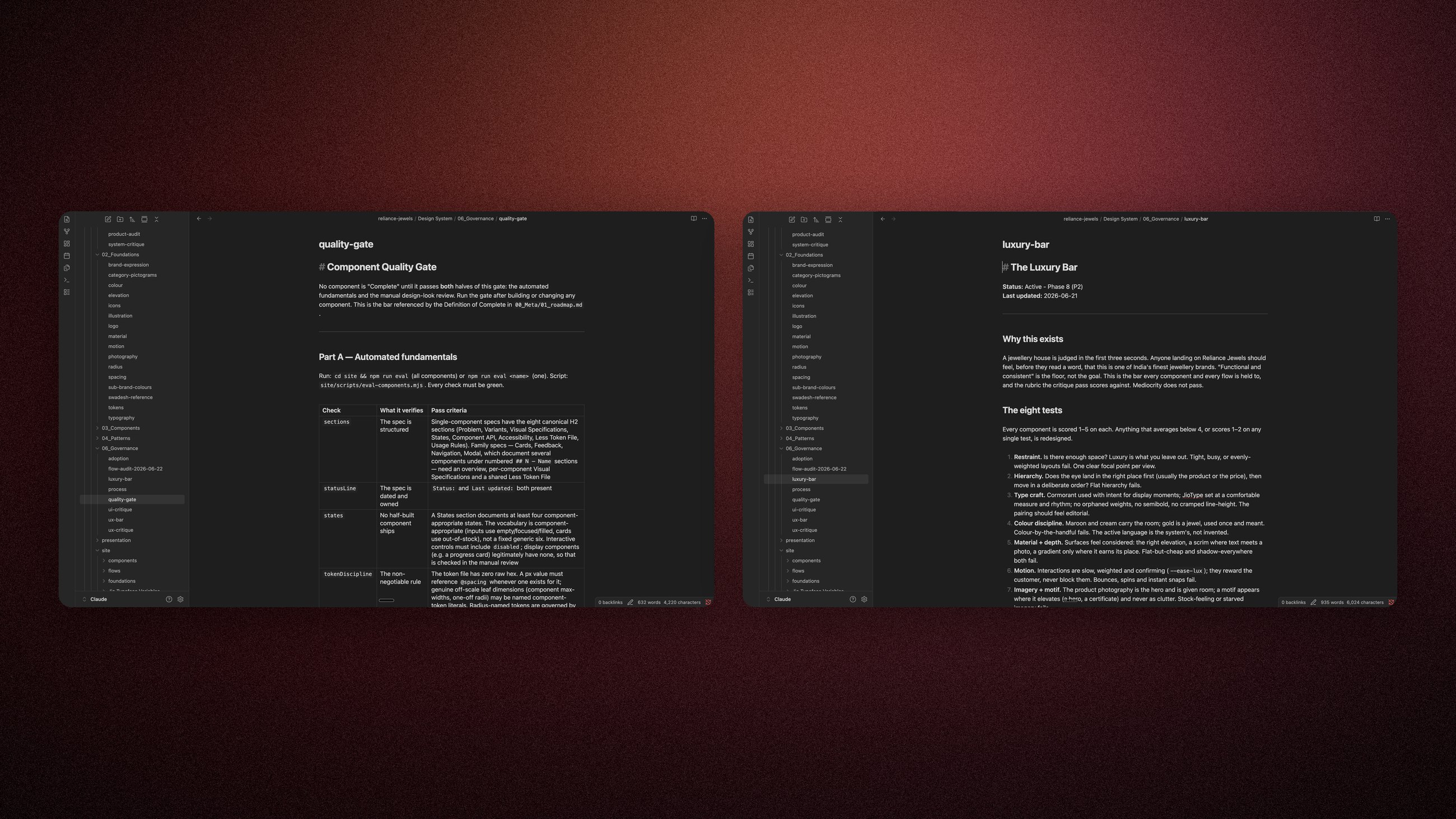
So I scored my own rebuilt journeys on those bars and published the scorecard with the weak numbers in it: my product-page flow scored 2.4 on UX. I wrote the fix plan in priority order rather than hiding the gap.
I published the 2.4 because a bar you can quietly lower isn't a bar.
Flow audit · 22 Jun 2026
1–5 · below 4 = fix before done
| Flow | UX | UI | Verdict |
|---|---|---|---|
| Homepage | 4.1 | 4.4 | good, parity gaps |
| Discover (PLP) | 3.4 | 4.2 | needs work |
| Consider (PDP) | 2.4 | 4.3 | major rework |
| Add to cart | 3.3 | 4.2 | needs work |
| Checkout | 3.3 | 4.2 | needs work |
| Confirmed | 4.4 | 4.5 | strong |
| Autopay setup | 3.2 | 3.0 | needs work |
| Return journey | 3.2 | 3.0 | needs work |
Published with the fix plan, sequenced PDP-first
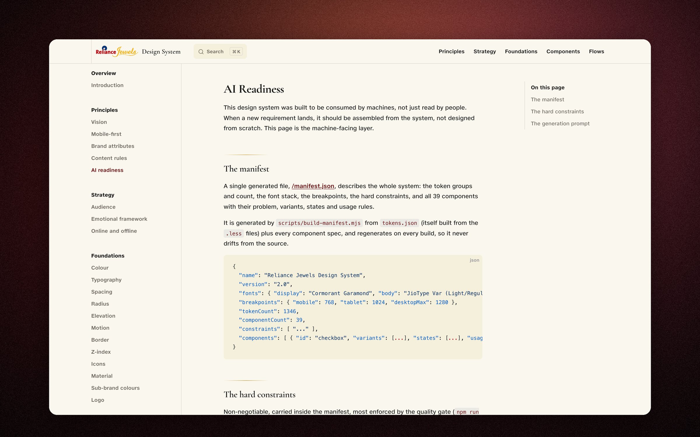
Three files that let a model build a real screen
The whole system in one generated file: token groups, all 45 components with problems, variants, states and rules. Regenerates on every build, so it never drifts.
Explicit, checkable rules carried inside the manifest. They are listed below, in full.
Tells a model to reuse before creating, use only tokens, honour the one active language, and flag a missing token instead of inlining a literal.
- 01No hex, no raw pixel, no hard-coded string in any component. Every value references a token.
- 02Three tiers: components reference semantics, semantics reference primitives. Components never touch a primitive.
- 03The .less file is the single source of truth. Figma variable names match the .less names.
- 04JioType Var has no semibold. Medium instead, always.
- 05Icons come from the DS Phosphor set: Light by default, Fill for active. Never a text glyph or a CSS-drawn shape.
- 06The maroon active language is one system across every component.
- 07Every component documents all its states. No half-built states ship.
- 08Touch targets stay at least 48px, even when the visible control is smaller.
- 09Indian English everywhere. One price format. No em-dashes. No Oxford comma.
- 10Cormorant Garamond owns display moments. JioType Var owns body, UI and every numeral.
- 11Components compose components: any reusable inner element comes from the system, never rebuilt inline.
What the rebuild was actually for
A brief goes in. Flows, screens, a prototype and the documentation come back the same day, all of it on-system.
This is the part the whole rebuild was for. Once every value carried its reason, we could point a model at the system and trust what came back.
- 01
Flows and edge cases
The states nobody thought to ask about, drafted the same day.
- 02
Screens, already on-system
Right colours, right spacing, right components. Nothing to clean up.
- 03
A prototype that behaves
Motion and real states, so people react to it instead of imagining it.
- 04
Docs back in Figma
The work writes itself into the library, so the system stays current.
The design system: 1552 named values and 45 components, each one carrying the reason it exists
Not yet
The same system pushes code we can merge ourselves. That is the goal and it is not built yet.
The fourth box is the one I would defend hardest. Plenty of people can show you a screen a model made. Almost nobody sends it back into the design file afterwards, so their documentation is stale a week later and the next designer is guessing again. That loop is the difference between a demo and a system.
Work that used to run in weeks now runs in hours, alignment meetings included. I have never instrumented that properly, because nobody here was measuring design timelines in the first place, so I will describe it and leave the percentage off.
Both teams build from it now
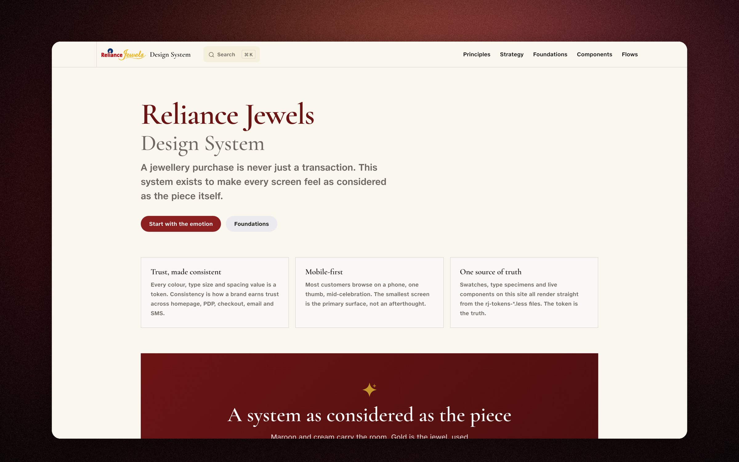
Designers get a finished screen the same day. Engineers build from the same file, because following it is now the fast path.
Product and engineering are both adopting the system. The old one had a typeface page and a colour wheel and nobody opening it. This one gets opened because it is quicker than not opening it.
What exists now: 45 components, 1552 named values shared by every screen, a documentation site that rebuilds itself from the code, a Figma library on the same names, and the storefront's main journeys rebuilt from those parts as proof. One change in one file reaches every screen, so the system is safe to change.
Some of it I deliberately did not finish. I held the line on naming, states and accessibility, and accepted good enough on visual flourish so the thing could ship. Knowing where not to gold-plate is part of the job.
The system is built and gated. It has not yet been rolled out across the live store; rollout is the next phase.
What I'd do differently
The conversation with the engineers should have been the first thing I did, not the thing I arrived at.
The thing I would change is at the start, not the end. I spent the opening stretch of this treating a design system as a design deliverable, and scoring the product from the buyer's side only. The people who had walked away from the old system had good reasons, and none of those reasons were visible from inside Figma. That conversation should have been week one, not the thing I eventually got round to.
The rest is unfinished business rather than regret. I would wire the quality gate into CI on the product repo from day one, so a component that breaks token discipline cannot merge. I would run adoption surface by surface against the live store instead of waiting for a big-bang rollout. And I would have the AI layer assemble a genuinely new surface end to end and count how much I correct. That correction rate is the honest score of the whole project, and I want the number.